- Product

- Pricing
- Affiliate Program
- Developers
- Resource
 EN
EN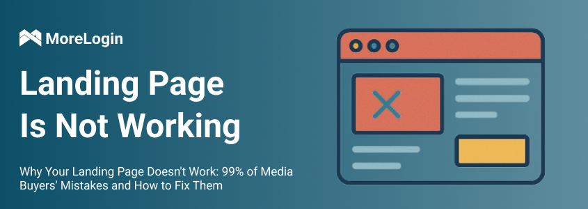
Yes, creative is crucial — that’s no secret. Every self-respecting media buyer knows that success often hinges on a strong ad creative. But the days when a flashy banner could singlehandedly drive profit are long gone. Today, a successful funnel is a system. And if the landing page fails, even a clickbait headline or a 15% CTR won’t save your campaign.
In this guide, we break down why your landing page fails to convert, the most common mistakes media buyers make, and how to fix them — with practical examples, visual schemes, and actionable tips for those looking to generate profit, not just burn budget.
There are three pillars that hold up the conversion rate (CR) of any landing page: analytics, structure, and a compelling call-to-action (CTA). The problem? Most pages lack all three.
Buyers build landing pages based on gut feeling — no heatmaps, no A/B tests, and no logic in block structure. Then they wonder why they get zero leads from 10,000 clicks.
If you don’t know where users drop off — you’re losing them everywhere.
Did the user fail to reach the registration button? Maybe it’s placed too low on the page. Is the exit point on the second screen? Check what’s there — too much text or a low-quality image can kill trust.
Solution:
Use heatmaps, scroll reports, and click tracking tools.
At a minimum, install Hotjar or Yandex.Metrica with session replay.
Ideally, measure funnel performance down to individual blocks and base decisions on data, not guesswork.
Chaos kills conversions. If your blocks are disorganized, your text doesn’t answer basic questions, and your CTA only appears at the bottom — the user won’t bother figuring it out.
Attention is your currency. If you don’t guide them, they’ll leave.
Recommended Landing Page Structure:
Block 1 – Highlight the main benefit
Block 2 – Reinforce with proof (stats, case study, calculator)
Block 3 – Show how easy it is
Block 4 – Clear CTA
Repeat the CTA after each meaningful block.
You can’t expect cold traffic to engage with a static page. A landing page should be a conversation, not a monologue.
What works:
Live calculations: Let users input numbers and see potential earnings.
Example: "Enter €500 — see how much you can earn in a week."
→ Calculation → Bonus CTA = engagement unlocked.
Quizzes and Surveys: Warm up your leads by offering a personalized offer in exchange for answering 3 questions. It segments traffic, increases engagement, and nudges users toward conversion.
Gamification: Spin wheels, mystery boxes, bonus grabs — anything that creates a micro-win. It activates player psychology: win → want more → register.
Your landing page must instantly communicate:
What the offer is
Why it matters
What the benefit is
What action is required
Avoid vague copy like “Welcome to a new era of trading…”. It sounds good, but says nothing. Instead, use:
“Earn up to €300/day investing from your phone. No experience needed. No risk. Try now.”
Direct. Clear. Benefit-focused.
In niches like crypto, investing, or e-commerce, users rarely convert on the first visit. That’s why capturing contact information is critical.
When to collect contacts:
When users scroll up or try to close the page → show a pop-up offering a free checklist in exchange for their email.
On the second screen → embed a contact form before attention fades.
If a user starts registration but doesn’t finish → remind them gently to enter their email to save their bonus.
Advanced Tip:
Some marketers remove all forms and use messenger-only contact. This reduces pressure and builds trust — but only works when the creative has already hooked the user.
If you're managing multiple accounts or running traffic arbitrage, anti-detect browsers are essential. Tools like MoreLogin let you:
Create isolated browser profiles
Prevent bans
Track multi-source traffic accurately
This is especially important when traffic comes from various platforms — without it, even warm leads can be lost due to poor tracking.

When a user is about to bounce (scrolling up or pressing "back"), you have one last chance to grab their attention.
How to retain them:
Offer a bonus or alternate offer
Launch a quiz: “What didn’t you like?” → reward them for answering
Show a modal popup: “Wait! You forgot your gift. Enter your email to receive it.”
Quick, clear, and pressure-free.
It’s time to stop thinking of landing pages as “just a place to send traffic.” They’re a critical conversion stage — the make-or-break moment in your funnel.
No analytics = you’re flying blind.
No structure = scattered attention, no direction.
No interactivity = no engagement or emotional hook.
No clear CTA = you’re not selling, just talking.
No contact capture = you're not just losing a lead — you're losing every future chance to close them.
In performance marketing and traffic arbitrage, these mistakes are costly — and often unforgivable.
EN